Starting from the bottom of this page, a transition from someone with no digital skills was crafted into someone who can hopefully hold his own… for now.
As you read, problems and thoughts I had while working on these projects will be put down. Also, my thoughts on the overall assignment will be displayed.
Like always, collaborations and suggestions welcomed!
After having been assigned specific tasks and projects, I now can show how this class and my future can intertwine. The point of this WordPress was to showcase off something you are passionate about and how this class help you learn that.
In a relatively short amount of time, I constructed a bracket of how I believe the end of the 2018-2019 NBA season will end, this combines my love of sports with Adobe Illustrator. Even though this is a small sample size, I can now do many more things since I have experience with these platforms. The best way to learn, is to try them out for yourself.
Going forward, I plan on learning how to use Photoshop and switch the uniform of a player to a completely different one. Number, color, and text will be changed, along with the background colors of fans. Also, the sports transitions in Adobe Premiere made for useful graphics in order to showcase a players stats or background information.
Hence the name and cover photo of the website. A “zone” is a type of defense played, and a “press” is a defense that’s played over the entirety of a court. A “press” could also be a media publisher, so there’s the wordplay. The cover photo is a man who is jumping through the air, and dunking a basketball. A fun cartoon-ish way to start the website.
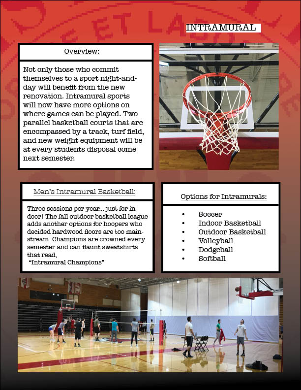
Now that I had confidence with my ability in the classroom, an assignment that required a group effort was put upon us. We chose a rather simple topic, the renovation of McCann and how it not only affects the DI athletes, but every other student too.
Problems we ran into involved preparing our templates. A group template was created, but content still ran onto other pages, and had to be accounted for. Fonts and color waves to be uniform also was a challenge.
The original creation of this had all the same fonts, but transitioning the work from Adobe InDesign to this project and others required font changes. Particularly, it was the Lucida Grande font that I would have to reapply every time I wanted to work on this project.
The third assignment was on Adobe Illustrator, and required a city to be created. A certain amount of buildings, texts, characters, and bodies of water had to be made.
Creating a landscape to hold all these features proved to be a problem I did not expect. Creating text boxes and then grouping the pixels together frustrated me to the point where my text was created from segmented lines. The 3D Extrude and Bevel feature I enjoyed.
I had my first experience with Photoshop, then another assignment is thrown right at me.
An add had to be made that promoted an aspect of campus that was worth noticing. I work at Student Activities on campus, and decided to show the type of environment that is seen at work.
Troubles mostly occured with layering and having to save a plethora of copies, so work wouldn’t be accidently deleted. I would like to work on my transparency ability in editing, being able to put photos on photos.
Before hopping into COM/MDIA 103 as a second semester freshman at Marist College, I had no previous experience with any Adobe platform, let alone Photoshop, Premiere, etc,.
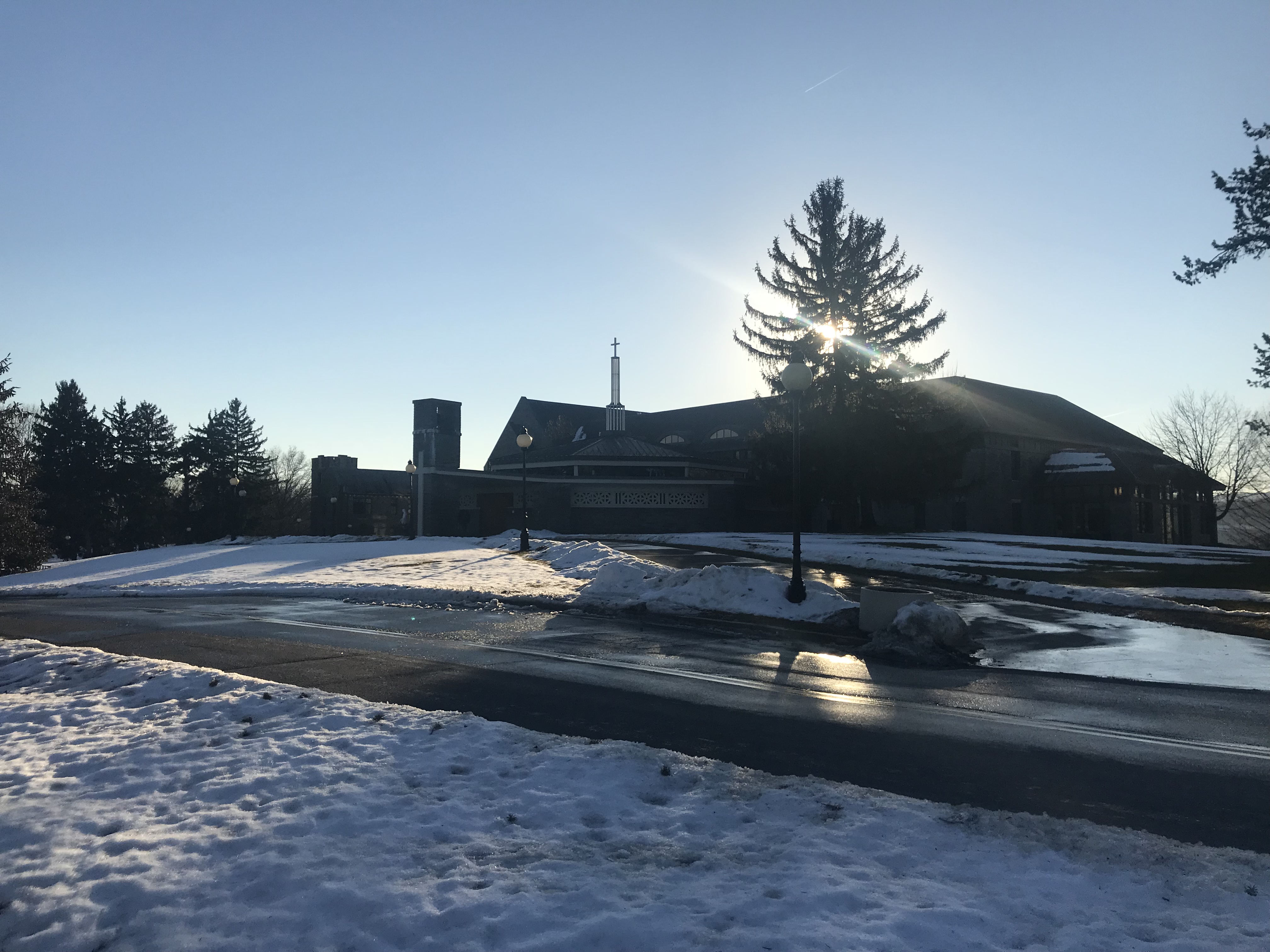
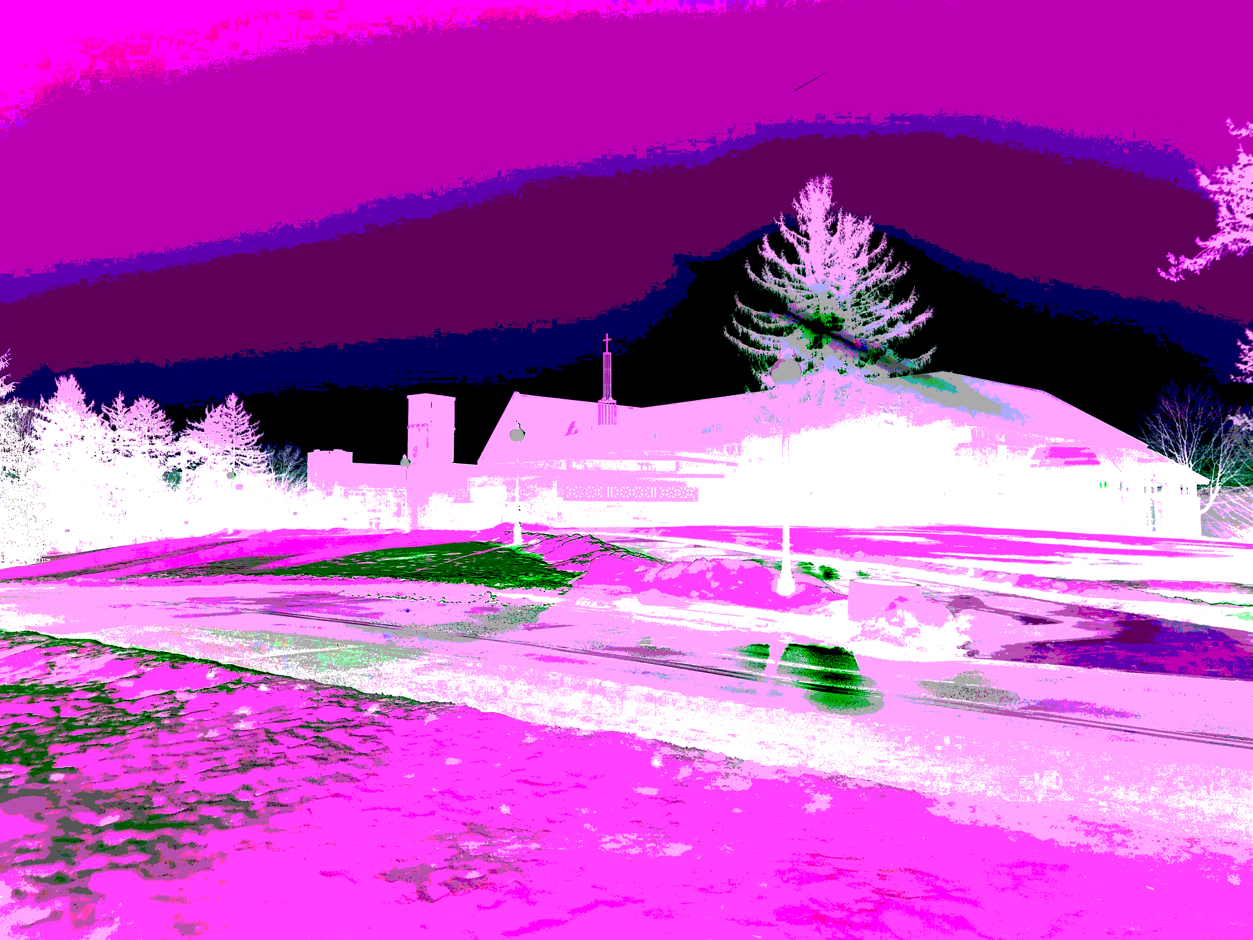
Ultimately, I was assigned to play around with color distortion on Adobe Photoshop for a grade. Creating a photo of just black and white, and color adjustment, and a wacky setting where needed for the photos.
My biggest problem was finding out a distinct difference between color distortion and a “wacky” setting being added. Maybe a warp could have been added.
The attached images are my variation of the normal photo next to the “wacky” one.